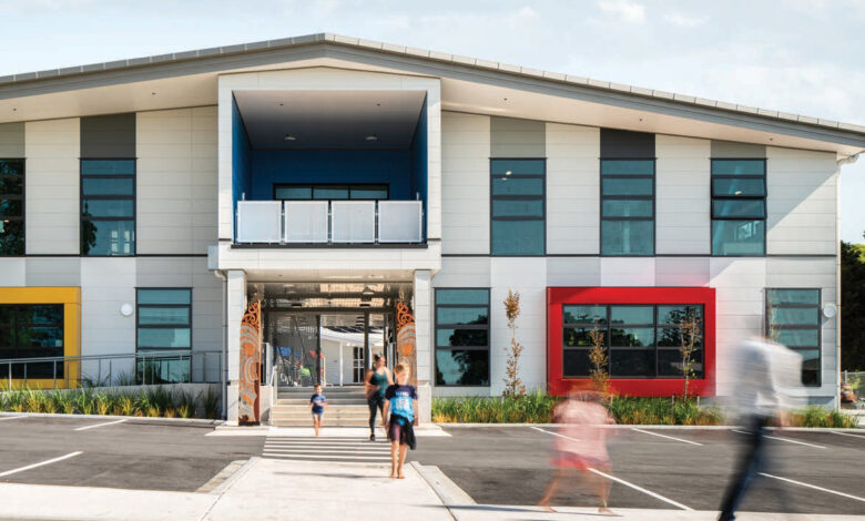
Stunning interior and exterior paintwork at the North Island school was undertaken to represent cultural identity and brighten up what is now one of the most inspiring learning environments in the country.
The latest print issue of School News magazine is available for free here.
Dulux Trade Specification Consultant Mark Fraider was brought in to facilitate the striking renovation, which was recognised as a finalist for Best Commercial and Multi-Residential Exterior at the 2020 Dulux Colour Awards.
Project challenges to overcome
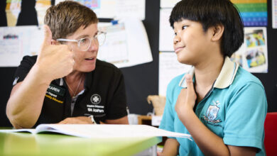
Ōhope Beach School was built in an exposed position in the valley with prevailing winds and sea spray from the coast, so coastal weather durability was prioritised for exterior painting. Meanwhile, the school’s high traffic interiors needed to cater to 300+ primary-aged students, so cleanliness and vibrancy were top priority indoors.
The exterior masonry of the school was painted with Elastomeric 201. This was chosen for its highly flexible, extremely weather resistant properties, and Weathershield for the other cladding and soffits. The school is built in an exposed position in the valley with prevailing winds and sea spray from the coast. The windows, aluminium joinery, entry gate and stair screen were all powder coated. The Dulux Duratec® range was chosen for this due to its high-performance colour retention and gloss specifications and ensures a durable and easy to maintain building.
Meanwhile, the school interior was painted in Wash & Wear Kitchen & Bathroom for its stain resistance, washability and anti-bacterial properties and all walls were brush and rolled while doors and trims were spray finished.
A playful feel for primary learners
Dulux wove stories from the region into the school’s exterior colour palette and designed the entrance with play in mind as poles, bay windows, frames and aluminium joinery were painted in bright blue, red, yellow and green powder coat colours.
“Each colour has significant meaning and is taken from the primary colours found in the school’s logo,” explains Mark: “Blue represents the school’s proximity to the ocean, red and green represent New Zealand’s native pohutukawa tree and yellow represents the sand found on Ōhope’s coastline.”
READ MORE: How to implement a painting maintenance plan.